Take Note
Stationery
An E-Commerce project for a local Stationery Shop

Tools Used
Sketch, Illustrator, InVision, Photoshop,
The Brief
To design an E-Commerce Solution to showcase their products while maintaining their small shop appeal.
Focusing on hand picked quality over quantity.
I would need to deliver the following to fulfil the brief:
-
Have clear ways of locating specific products
-
Support a single page for each product which can be linked to directly
-
Have an efficient way of purchasing one or more products
-
Steer customers toward popular products.
Introduction
Take Note are a local stationery shop located on Whitechapel high Street. They have been part of Aldgate’s dynamic community since 1982. They strongly believe in good quality products at reasonable prices, good customer Service and supporting the local community where possible and maintaining their small shop appeal.
Team: Individual Project
Design Sprint: 2 Week Sprint
Role: Research | UX | UI Designer
Discovery
Some initial things to consider
-
Have clear ways of locating specific products
-
Support a single page for each product which can be linked to directly
-
Have an efficient way of purchasing one or more products
-
Steer customers toward popular products.

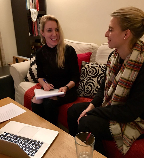
User Interviews
I conducted 5 main interviews and also spoke to a number of friends in passing about their motives for shopping online for stationery or if they preferred to go in store and why. I also needed to determine if there were any pain points when shopping online to see if there were any key factors in what makes for the best online shopping experience.
Key Quotes:
Sally
“I don’t like hunting for things,
I like sites that are
easy to navigate”
Tori
“I love shopping online
as it saves me time, you name it,
I buy it!”
Mark
“I like lots of good reviews
as I’ve been conned before in
the past”
Key Themes
Based on my user interviews I discovered that most people had very similar needs…
-
Wanting to save time
-
Were influenced by user reviews
-
Preferred sites that were easy to navigate
-
Next day delivery was also key
Key Pain Points
-
Not being able to find what they are looking for
-
Bad customer service
-
Lack of product information
-
Long complicated order forms

Contextual Enquiry
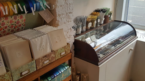
I decided the best way to do my competitive research was to not only look online but also do a few field visits for some contextual enquiry. From looking at the main big brands Paperchase and Rymans, I could see they weren’t in direct competition for Take Note Stationery. They don’t really have that small shop appeal. Although Paperchase has a nice way of inspiring gift ideas and portrays an art craft feel to all their brands.
Choosing Keeping and Present and Correct were two other stationery shops I visited. They are local and most definitely maintain that small shop feel with a personal touch. They give off the sense of supplying for community so I class them to be Take Notes direct competitors.
Define
Personas
My findings from all the interviews allowed me to create a persona most suitable to represent my user when making key design decisions.

She likes to support local businesses where possible
GOALS
-
To be original
-
To be successful
NEEDS
-
Good customer service
-
Reliable delivery information
Rachel
26, London
In a relationship
Fashion Retailer
To help me get a vision in my head, I needed to define the problem, by focusing on Rachel's goal I creating a scenario to design a solution for.
Develop
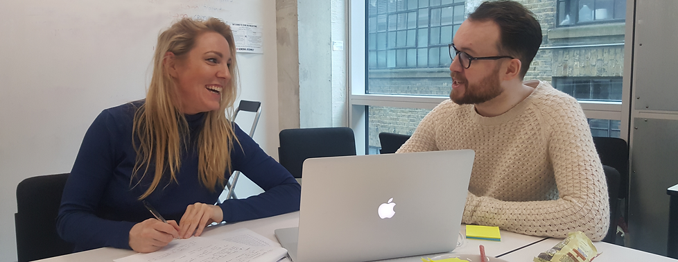
Design Studio
I then conducted a mini design studio with two other students in my UXDI cohort at General Assembly. I introduced my primary persona Rachel. Before we began sketching out ideas for Rachels scenario which was to find inspiration for a gift idea for a friend and then purchase with next day delivery.
Before I could start sketching out the screens I needed for my wireflow and paper prototype, I needed to research which categories my users would expect to see on Take Notes Stationery website.
Information Architecture
Card sorting was next up, this type of methodology gave me great insights as to what categories my users would expect to see certain types of stationery. Allowing users to easily locate everything they need and save time which was the key basis of my users needs based on my research.

Closed Card Sort
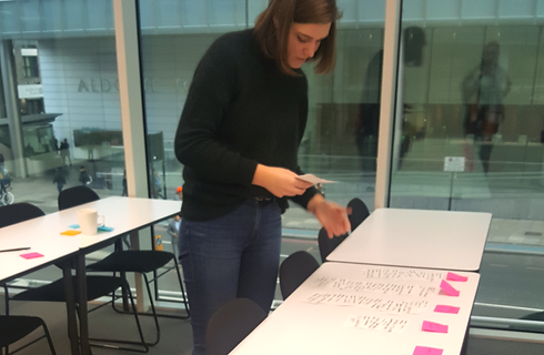
I put everything in the inventory onto individual cards, shuffled them together, and gave these to my volunteers to see what categories they came up with.
I completed four open card sorts to let users choose the categories.
Open Card Sort
I put everything in the inventory onto individual cards, shuffled them together, and gave these to my volunteers to see what categories they came up with.
I completed four open card sorts to let users choose the categories.
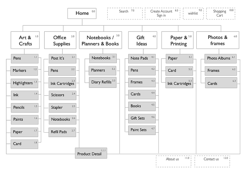
Site Map
Based on the information from the card sorts, clear hierarchical categories were evident. I then created a site map for my website placing all the chosen products within each category.
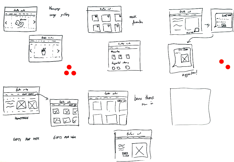
Wireflow
With the hierarchy now sorted for the website It was time to get stuck into the ideation of how the relevant pages for my wireflow would look. Keeping in mind my users main needs which was to be able to navigate easily around the site and find product information and reviews.

Press the arrows to flick between screens
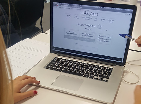
Prototyping and Testing
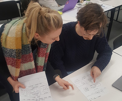

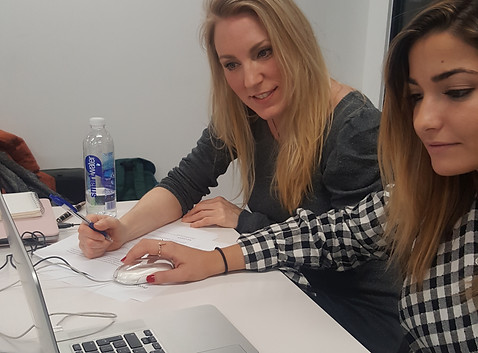
Excited to now put all my research into practice, I chose some users to test my first version of my paper prototype.
I conducted four users tests and here is some of the feedback I received and some changes that needed to be made.
Key Changes:
-
Cart pop up box needs to be bigger
-
Order of check in page needs to be switched around
-
Back button option needed on product page
Below you can see the main changes I made on the low fidelity prototype circled in red
Paper to Low Fidelity
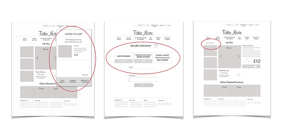
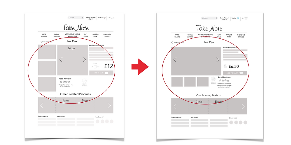
Mid Fidelity
Key Changes:
-
Main product image needs to be larger
-
Move thumb nail images below main image
-
Change wording of ‘other related products’
-
Wishlist page items need to be smaller
-
Order form is too crowded

Deliver
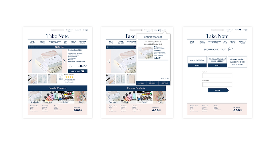
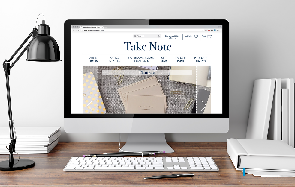
High Fidelity Screens


What's Next
Time for more user testing and to implement some of the points below.
-
Order form still needs simplifying
-
‘Chat help’ feature to add more of a personal touch
-
Option to add your own review in the reviews section
-
Reward loyalty for repeat customers
The process is never over, iterate, iterate, iterate…….
Conclusion
Having never designed a website from a user experience point of view before, it was a huge learning curve to discover the importance of information architecture. improving peoples shopping experience online in this case was all about speed and being able to read reviews and product information as well as be inspired.
I am most proud of how I delivered a high fidelity prototype that was easy to navigate and users intuitively knew where to click to find things to complete simple tasks.
Thank you for reading.
Click here if you would like to view my full case study on Medium.